Figures
Every figure in this manual is a MarketFigure, or a mosaickit
canvas built by a function such as ppf_canvas(). Both have a square plot
area and arrowed axes with no ticks or grid. Curves are named at their ends,
areas inside them and values on the axes, and no text covers a line, a
point, an area or other text.
MarketFigure
MarketFigureColours and line widths (Palettes and themes).
Shorthand for PlotTheme.from_palette(palette); theme takes precedence when both are given.
Overrides for built-in labels, by layer id (Labels and layers).
Shows or hides layers, by layer id (Labels and layers).
A market diagram on a mosaickit canvas, with axes from 0 to
x_max and y_max. Axis titles are LaTeX math unless they are words; an
empty title draws none.
MarketFigure.add_curves(
    demand,
    supply,
    q_max,
    demand_label="$D$",
    supply_label="$S$"
)
MarketFigure.add_equilibrium(
    result,
    label="$e^*$",
    color=None
)
Draw demand and supply from \(Q = 0\) to q_max, each named at its end, and
mark an equilibrium with a filled point and its label.
Each topic adds its own methods, described in its chapter (see
Topic methods of MarketFigure).
finalize() hides guide lines that would cut a shaded welfare region in
two (the value stays marked on its axis) and, only with legend=True,
adds a legend. save() writes PNG, SVG or PDF according to the extension
and creates missing directories. close() is a no-op kept for
compatibility.
MarketFigure.add_layer(layer)
MarketFigure.add_layers(layers)
Add any mosaickit layer, for annotations the topic methods do not
provide. An axis mark replaces an earlier mark at the same value. The
finished scene is available as fig.scene.
MarketFigure.add_metrics(
    values,
    *,
    title=None,
    location="upper right"
)
A text box of name--value pairs, for notebooks and debugging. Teaching figures leave it out: the numbers belong in the text.
Labels and layers
Every line, point, area and piece of text in a figure is a layer with a
stable id, such as market.demand, market.demand.label or
market.welfare.dwl. The ids follow the structure of the figure:
axes.* for the axes, market.<part> for each element, and a .label
suffix for the text that names it. fig.layer_ids lists every layer;
fig.label_ids lists the configurable text (labels, axis marks and
braces).
Label(
    text=None,
    visible=None,
    offset=None
)
An override for one built-in label. Fields left as None keep the
package's default. An offset in points opts the label out of automatic
placement and moves it by exactly that much.
MarketFigure.configure_label(
    layer id,
    label=None,
    *,
    text=None,
    visible=None,
    offset=None
)
MarketFigure.configure_layer(
    layer id,
    *,
    visible
)
Rename, hide or move one label (the id may omit its final .label), or
show or hide any layer. hide(*ids) and show(*ids) toggle several at
once. Each returns the figure.
The same overrides can be passed when the figure is created, as labels=
and visibility= mappings; they then apply to layers added later as well.
Aggregation figures and the canvas functions (ppf_canvas(),
public_good_canvas(), ...) accept the same two arguments. See
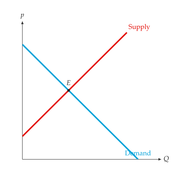
Renamed curves and equilibrium point.:
from principle_viz import Label, MarketFigure

fig = MarketFigure(
    x_max=12,
    y_max=12,
    labels={
        "market.demand.label": Label(text="Demand"),
        "market.supply.label": Label(text="Supply"),
    },
)
fig.add_curves(demand, supply, q_max=10)
fig.add_equilibrium(eq)
fig.configure_label("market.equilibrium", text="$E$")
fig.hide("axes.origin.label")
fig.finalize()
Palettes and themes
A ColorModel assigns a colour to each economic role; a PlotTheme adds line
widths and axis options and compiles both into a mosaickit theme.
Built-in colour models lists the four built-in colour models.
ColorModel(
    name,
    axis_color,
    label_color,
    demand_color,
    supply_color,
    ...
)
Named colour roles: axis_color, label_color, demand_color,
supply_color, baseline_color, shifted_color, tax_color,
control_color, cs_color, ps_color, tax_revenue_color, dwl_color
and arrow_color. Each is "#hex" or a mosaickit palette name
such as "blue".
mosaickit hues: demand blue, supply red, deadweight loss teal; surpluses in the curve hues at 15% opacity
A colour-blind-friendly qualitative palette
The Nord palette
Black, white and greys, for print
list_color_models() returns the names and get_color_model(name) the
model; the four are also exported as DEFAULT_COLOR_MODEL,
COLORBLIND_COLOR_MODEL, NORD_COLOR_MODEL and MONOCHROME_COLOR_MODEL.
PlotTheme(
    color_model=...,
    demand_linewidth=3.5,
    supply_linewidth=3.5,
    ...
)
PlotTheme.from_palette(name, **options)
A colour model with line widths (demand_linewidth,
supply_linewidth, shifted_linewidth, tax_linewidth,
arrow_linewidth, dashed_linewidth), equilibrium_marker_size, and
the switches show_grid, show_ticks, show_axis_arrows and
show_origin_label. from_palette() starts from a built-in colour model
and sets any of these fields.
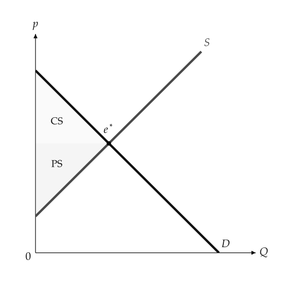
The palette argument selects a colour model (see The monochrome palette.):
fig = MarketFigure(x_max=12, y_max=12, palette="monochrome")
Canvases
CanvasThe mosaickit Canvas with the same labels=, visibility=,
configure_label(), configure_layer(), hide(), show(),
layer_ids and label_ids as MarketFigure. The canvas functions of
the PPF, public-good and revenue chapters return it; save it with
save(), or combine several with mosaickit.CanvasGrid.