多面板图与需求图
econ-viz 在 Canvas 之上提供更高级的教学组件:
Figure:多面板布局PricePath与IncomePath:让预算与均衡随参数移动DemandDiagram:联动的商品空间图与马歇尔需求图decompose_price_effect(...):Hicks 与 Slutsky 分解EdgeworthBox:两人交换的 Edgeworth 盒状图
多面板图
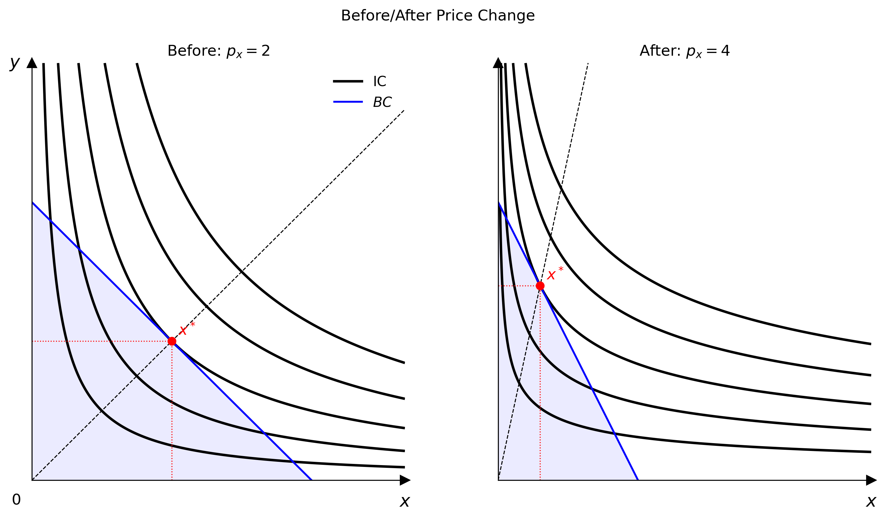
一个面板不够用时就用 Figure,例如变动前后的比较、效应分解图或课堂演示文稿。
from econ_viz import Figure, Layout, levels, solve
from econ_viz.models import CobbDouglas

fig = Figure(
    Layout.SIDE_BY_SIDE,
    x_max=20,
    y_max=15,
    x_label="x",
    y_label="y",
    title="Before / After Price Change",
    shared_y=True,
)

cases = [
    (CobbDouglas(alpha=0.5, beta=0.5), 2.0, 3.0, 30.0, r"Before: $p_x=2$"),
    (CobbDouglas(alpha=0.3, beta=0.7), 4.0, 3.0, 30.0, r"After: $p_x=4$"),
]

for idx, (model, px, py, income, title) in enumerate(cases):
    eq = solve(model, px=px, py=py, income=income)
    panel = fig[idx]
    panel.ax.set_title(title)
    panel.add_utility(model, levels=levels.around(eq.utility, n=5), label="IC")
    panel.add_budget(px, py, income, fill=True, label="BC")
    panel.add_equilibrium(eq, show_ray=True)

fig[0].show_legend(loc="upper right")
fig.save("figure_side_by_side.png")
可用的布局
Figure 提供以下布局:
Layout.SINGLELayout.STACKEDLayout.SIDE_BY_SIDELayout.TOP_TWO_BOTTOM_ONELayout.TOP_ONE_BOTTOM_TWOLayout.GRID_2X2Layout.GRID_3X3
Figure[idx] 会返回一个面板 Canvas,所以布局建好之后,绘图 API 完全相同。
路径工具
路径对象会让某一个预算参数逐步变动,并在每一步重新求解消费者问题。
from econ_viz import IncomePath, LinearBudget, PricePath
from econ_viz.models import CobbDouglas

model = CobbDouglas(alpha=0.5, beta=0.5)
budget = LinearBudget(px=2.0, py=2.0, income=40.0)

price_path = PricePath(
    model,
    budget=budget,
    price="px",
    price_range=(0.8, 6.0),
    n=40,
)
income_path = IncomePath(
    model,
    budget=budget,
    income_range=(20.0, 80.0),
    n=30,
)
这些路径可以用来:
- 用
Canvas.add_path(...)画出 PCC / ICC 形式的均衡轨迹 - 传入
DemandDiagram - 观察价格或收入变动时,消费束如何移动
需求图
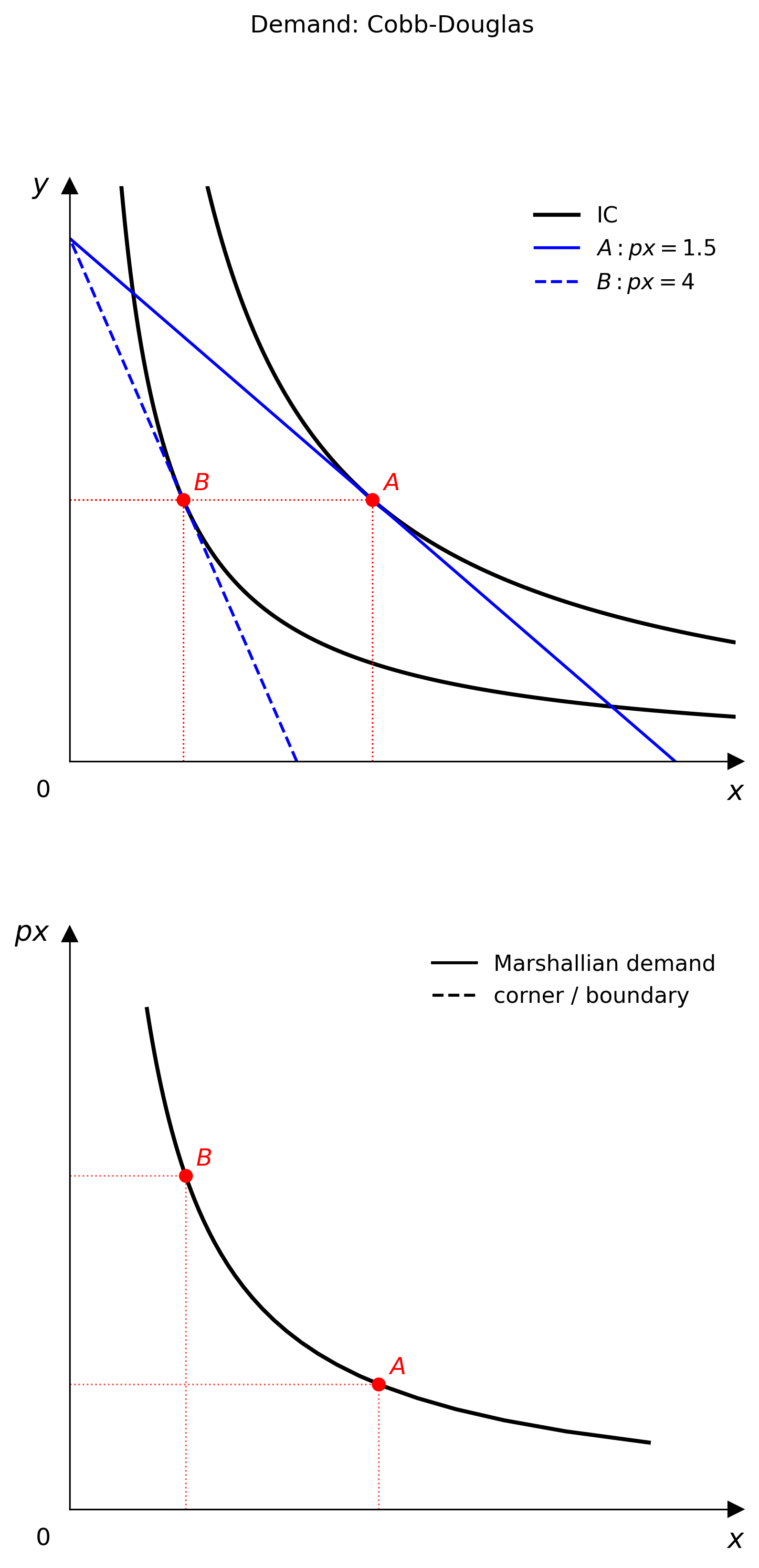
DemandDiagram 会创建上下两个面板的图:
- 上方面板:无差异曲线、预算线与均衡点
- 下方面板:对应的马歇尔需求曲线
from econ_viz import DemandDiagram, LinearBudget, PricePath
from econ_viz.models import CobbDouglas

model = CobbDouglas(alpha=0.5, beta=0.5)
budget = LinearBudget(px=2.0, py=2.0, income=40.0)
path = PricePath(
    model,
    budget=budget,
    price="px",
    price_range=(0.8, 6.0),
    n=40,
)

fig = DemandDiagram(path, title="Demand: Cobb-Douglas")
fig.add_marshallian_panel(
    price_markers=[1.5, 4.0],
    show_pcc=False,
    show_demand_guides=True,
)
fig.save("demand_cobb_douglas.png")
注意事项
创建需求图时请注意以下限制:
DemandDiagram目前只接受PricePath- 平滑、有折点与角点解的需求情况会分别处理,让下方面板在经济意义上保持正确
show_pcc=True会在商品空间面板上叠加价格消费曲线
价格效应分解
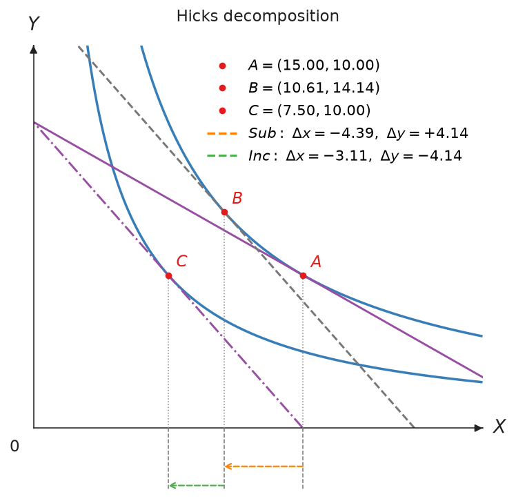
decompose_price_effect(...) 将价格变动分成替代效应与收入效应。HICKS 固定原来的效用水平;SLUTSKY 则让原来的消费组合在新价格下仍买得起。
from econ_viz import Canvas, DecompositionMethod, levels
from econ_viz.models import CobbDouglas
from econ_viz.optimizer import decompose_price_effect

model = CobbDouglas(alpha=0.5, beta=0.5)
result = decompose_price_effect(
    model,
    px=(2.0, 4.0),
    py=3.0,
    income=60.0,
    method=DecompositionMethod.HICKS,
)

(
    Canvas(x_max=25, y_max=25, title="Hicks decomposition")
    .add_decomposition(
        result,
        show_arrows=True,
        label_effects=True,
        show_x_projections=True,
    )
    .save("hicks.png")
)
add_decomposition 默认会画出通过 A 与 C 的无差异曲线;Slutsky 分解的 B 不在原来的曲线上,所以还会多画一条通过 B 的曲线。如果要自己用 add_utility 画,传入 show_curves=False 即可。
result.A、result.B 与 result.C 分别是原始、补偿后与最终消费组合。结果也包含 substitution_effect、income_effect、total_effect 与 compensated_income。
用 Effect 可设置每个效应的颜色、坐标轴下方范围箭头的高度,以及旁边的标签。point_label 可移动或隐藏 A、B、C 标签:
from econ_viz import Effect, Label

canvas.add_decomposition(
    result,
    substitution=Effect(color="#E67E22", label="SE", label_position="top"),
    income=Effect(color="#27AE60", label="IE"),
    point_label=Label(visible=False),
)
curve_stroke 与 curve_label 可调整这些曲线的样式并加上标签,legend 则决定图例的位置:
from econ_viz import Label, Legend, Stroke

canvas.add_decomposition(
    result,
    curve_stroke=Stroke(opacity=0.6),        # 调整 U0、U1(与 U_B)的样式
    curve_label=Label(position="top"),       # 显示 U0、U1 标签
    legend=Legend(position="bottom"),        # 或 Legend(visible=False)
)
Edgeworth 盒状图
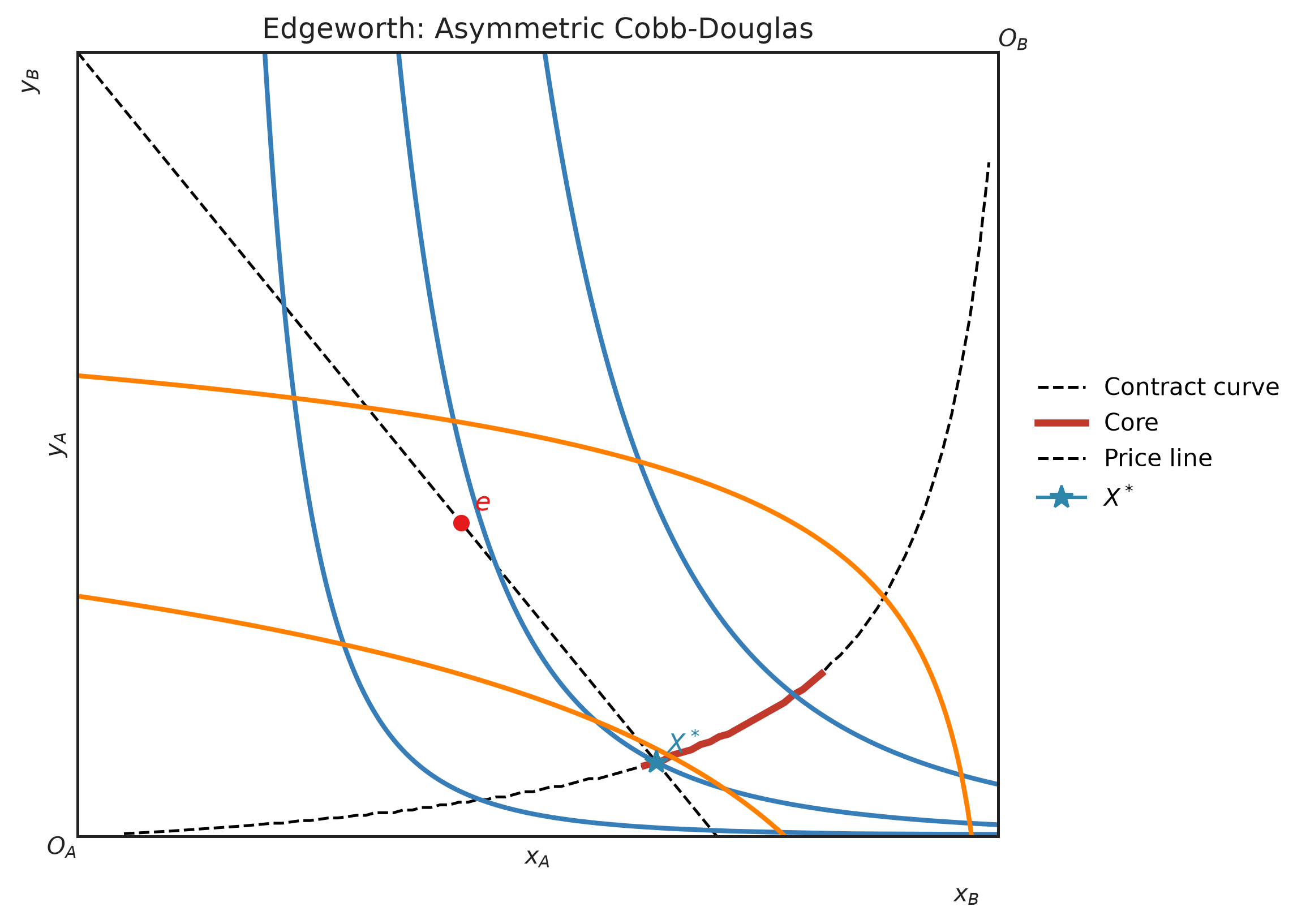
EdgeworthBox 用来绘制两人交换经济。消费者 A 从左下角原点计量,消费者 B 则从右上角原点计量。
from econ_viz import EdgeworthBox
from econ_viz.models import CobbDouglas

box = EdgeworthBox(
    CobbDouglas(alpha=0.8, beta=0.2),
    CobbDouglas(alpha=0.2, beta=0.8),
    total_x=12.0,
    total_y=10.0,
    title="Asymmetric Cobb-Douglas",
)

(
    box.add_endowment(5.0, 4.0)
    .add_contract_curve(n=100, method="mrs")
    .add_core()
    .add_price_line(px=1.2, py=1.0)
    .add_walrasian_equilibrium(px=1.2, py=1.0)
    .show_legend(loc="center left", bbox_to_anchor=(1.02, 0.5))
    .save("edgeworth.png")
)
平滑偏好可使用 method="mrs"。有折点、角解或自定义分段效用函数时,使用 method="pareto"。
绘制路径
不需要完整的需求图时,也可以直接在 Canvas 上画出路径。
from econ_viz import Canvas, levels

eq = price_path.equilibria[len(price_path.equilibria) // 2]
lvls = levels.around(eq.utility, n=5)

Canvas(x_max=25, y_max=20) \
    .add_utility(model, levels=lvls) \
    .add_path(price_path, label="PCC") \
    .save("price_path.png")